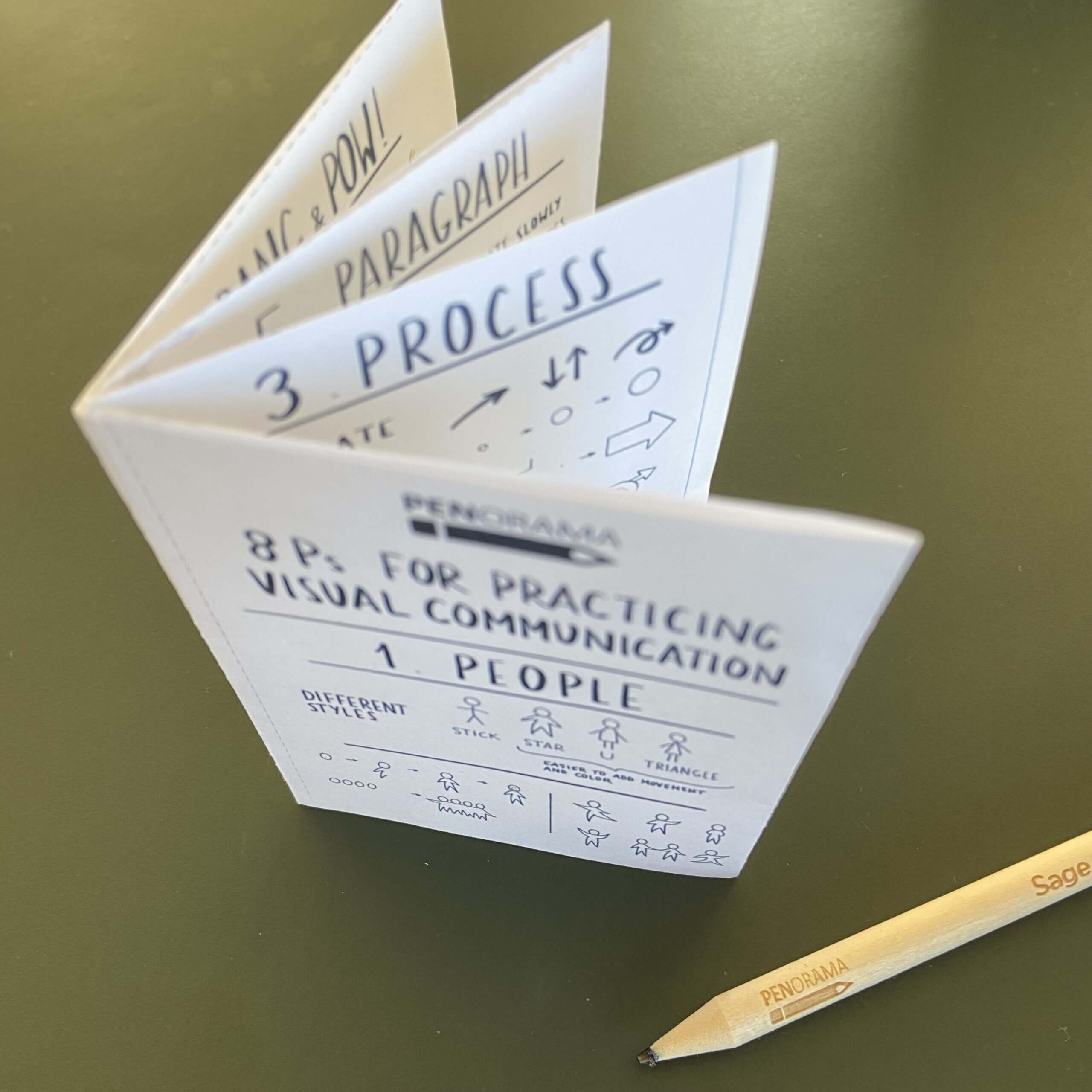
Pen & papers, please !
Here I will guide you through the 8 Ps, so you can see how easy it is to cure the ICD (I Can’t Draw) syndrome that many adults suffer from. Practice these 8 elements, focus on simplicity and you are ready to start seeing the power of visuals in your communication.
1. People
2. Place
3. Process
4. Placeholders
5. Paragraph
6. Paint
7. Pang & pow
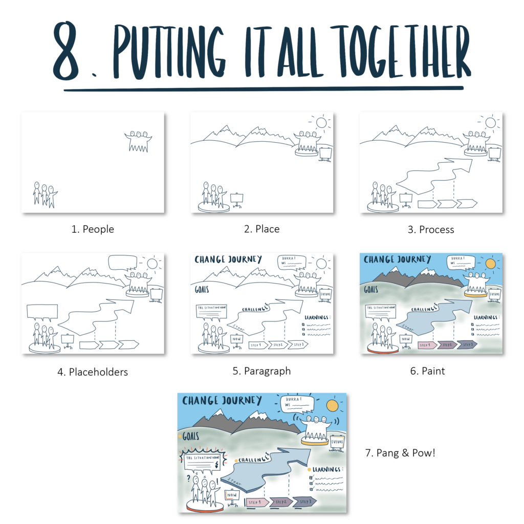
8. Putting it all together
1. PEOPLE
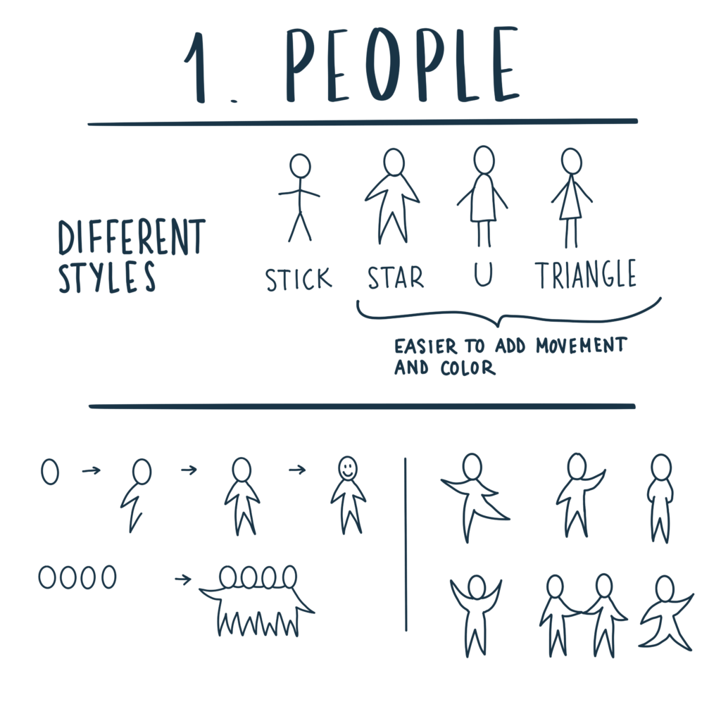
An important part of visualizing anything is people. Communication is between people. Projects are managed by people. Changes most often concern people. Organizations consist of people.
Adding figures to a visualization tell us something about who is involved. We can see ourselves, our colleagues and our stakeholders; where we belong and what our role is.
2. Place 🏙
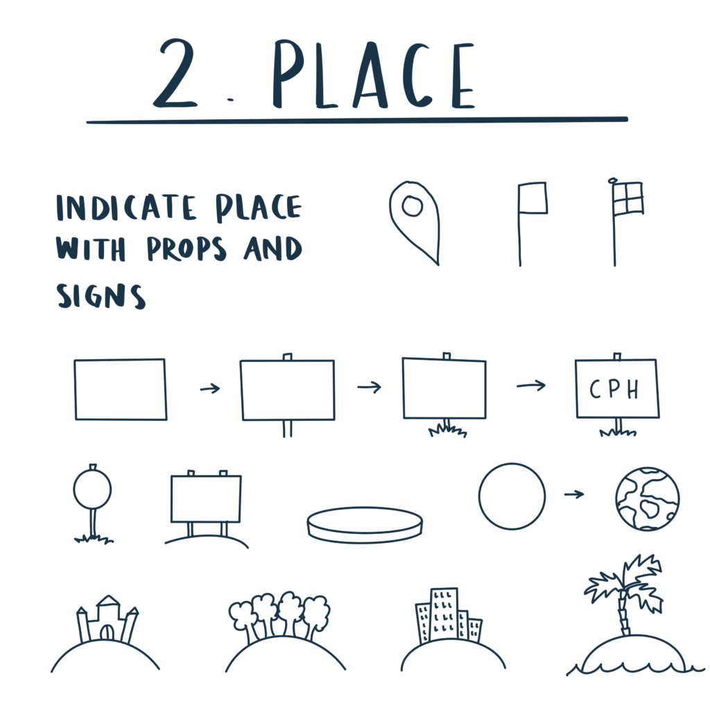
The second element that you should practice is where and when. To be able to orient ourselves in a visualization it is good to show where things take place and when. Again, the rule of thumb is to keep it simple and indicate the place with signs, stands, and stickers.
3. Process
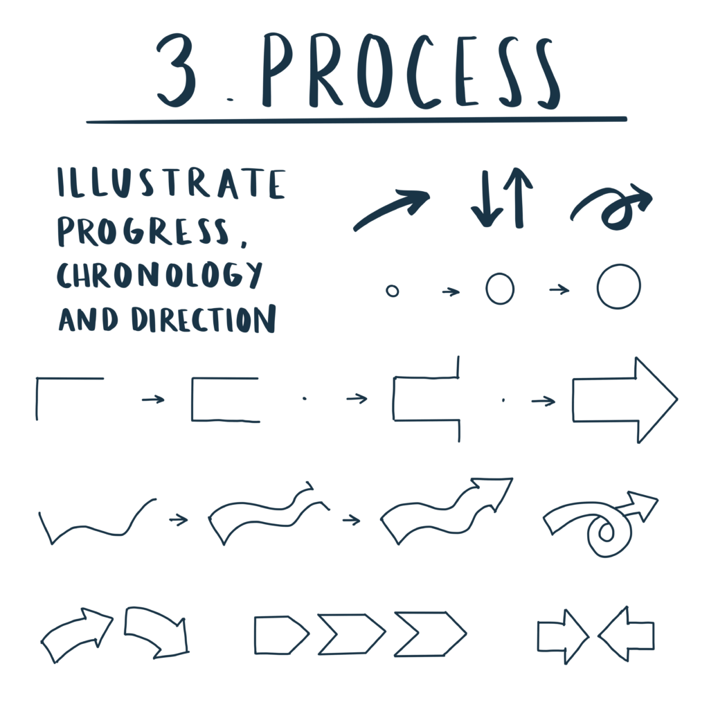
The third element that you should practice is illustrating processes. This enable you to indicate progress and change in your illustrations. Showing a starting point, one or more steps, and an end point help us describe the journey and how to go from A to B.
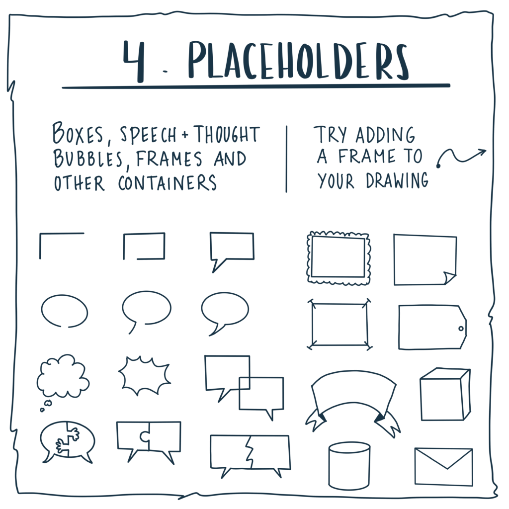
4. Placeholders
Use placeholders to keep text organized or highlight things in your illustration, or use them to add quotes, emotions and thoughts. ‘Placeholders’ can be speech and thought bubbles, boxes, papers, banners and frames. Try adding a simple border around your drawing to make the paper stand out.
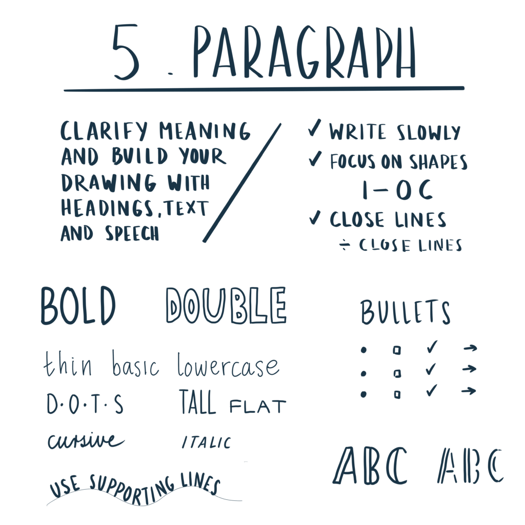
5. Paragraph
Use text in your illustration to add information. Combining drawings and text makes your content sharper and clearer.
Write slowly to make it easier to read. Focus on shapes and ‘close’ the letters. Experiment with size and fonts.
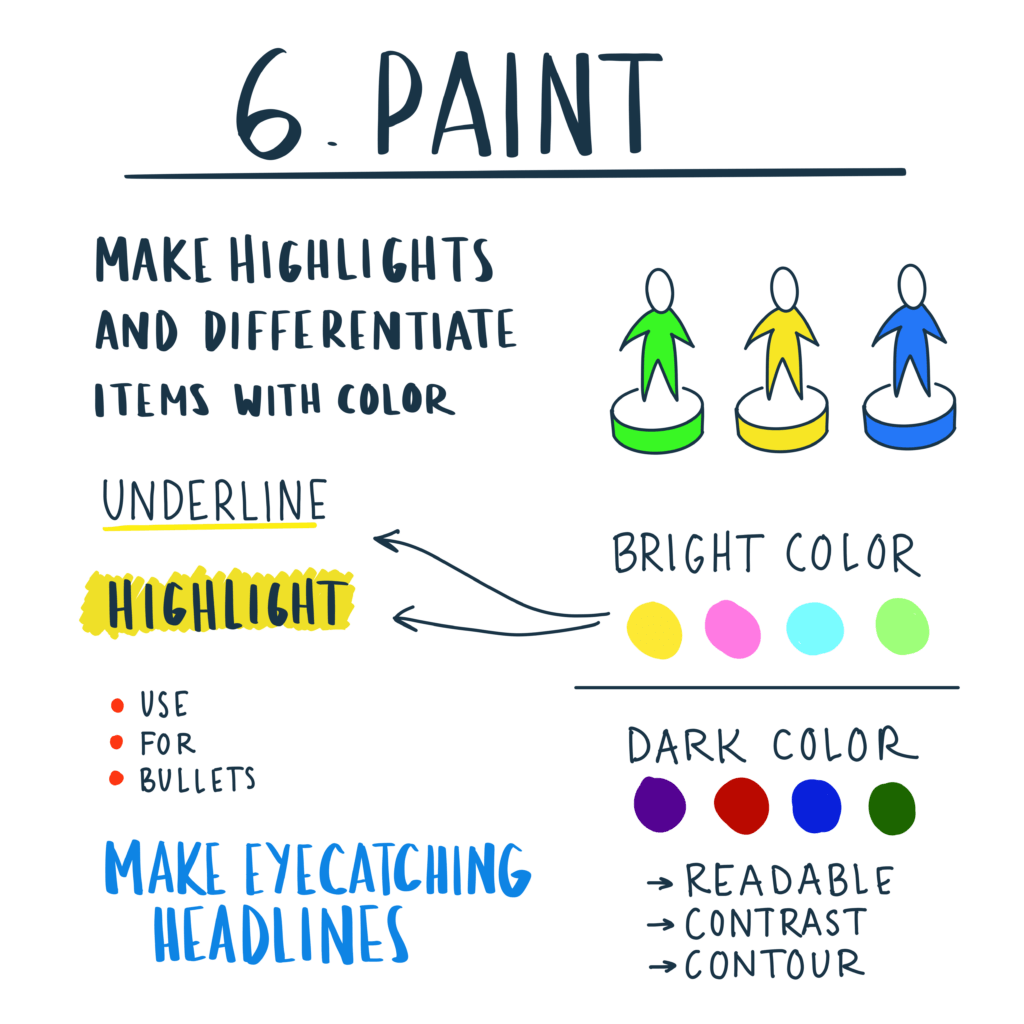
6. Paint
Highlight text or drawings with color, or to emphasize certain keywords. Make your headline stand out and use color to show differences, similarities or relationships.
Choose light colors for emphasis and impact, and darker colors for readable text, outlines or to add contrast.
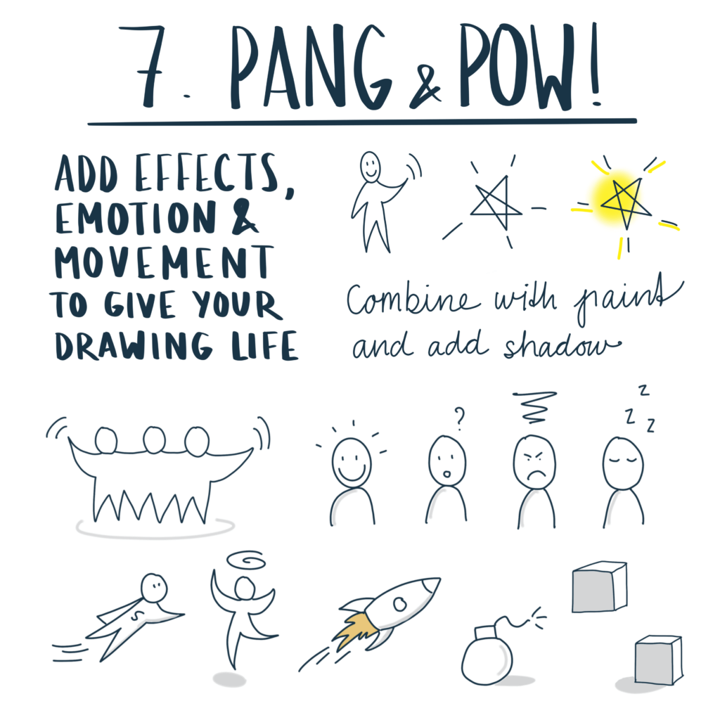
7. Pang & pow
Use lines, doodles, colors and shadows to add impact to your illustration and create movement.
Add emotions to the characters and watch the illustration come to life.
8. Putting it all together
Now it’s time to put it all together and build your illustration or template.
Practice, experiment and implement little by little in a context you are comfortable with.
Happy drawing 😊

